Commissioned to rebrand the not-for-profit organisation Eastern Community Legal Centre, our studio developed a fresh new visual identity that incorporated illustration as a unique and approachable design element.
The illustrative style was created to help support and communicate the wide range of important — and often complex or serious — social issues ECLC works with every day. By introducing warmth, personality and accessibility into the brand, the new direction allows communications to feel more engaging, human and relatable, while still maintaining professionalism and trust.
Our presentation was developed as both a visual showcase of the new brand direction and a practical brand framework. This created a flexible reference guide. And this guide could be used across future communications without the need for a separate style guide document.
This included:
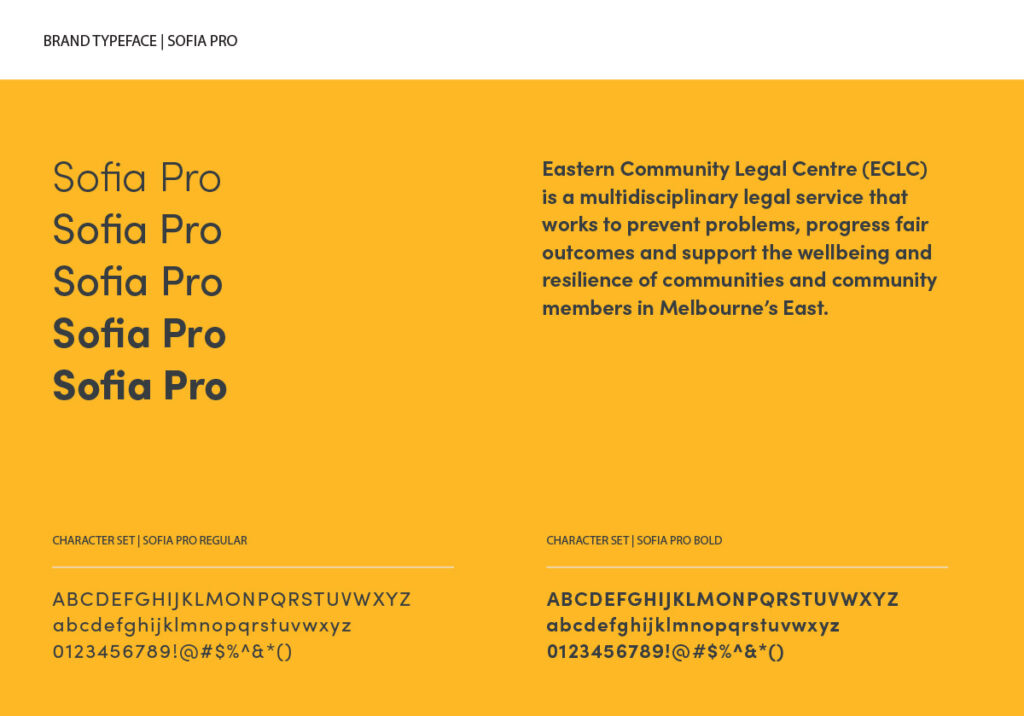
- typography selection,
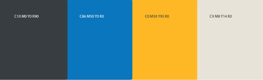
- colour specifications,
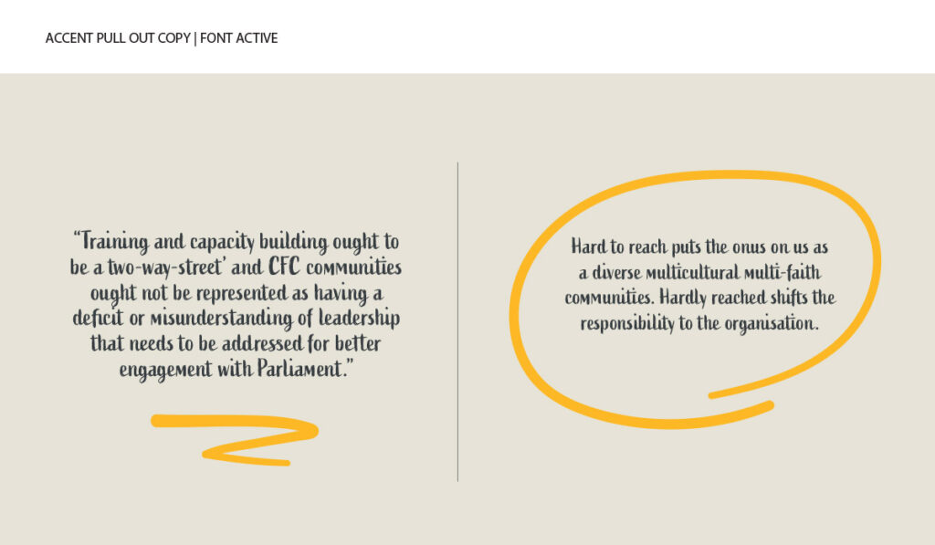
- quote treatments,
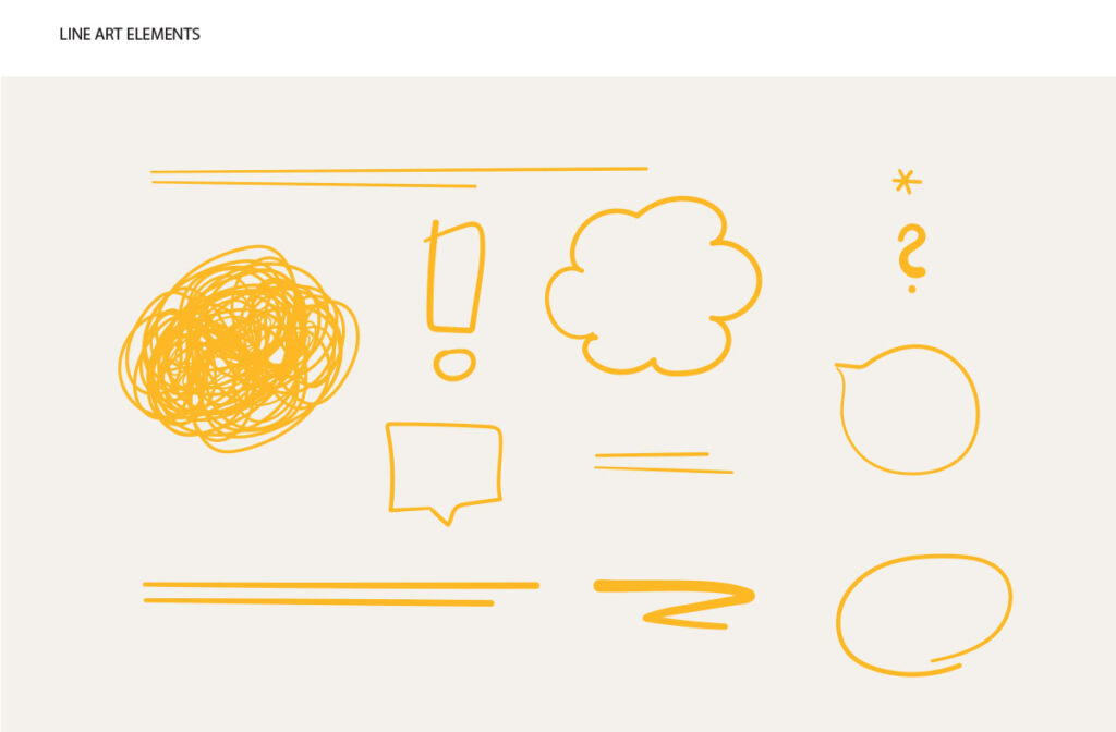
- graphic accent elements, and
- a flexible suite of illustrations designed to work across multiple applications.
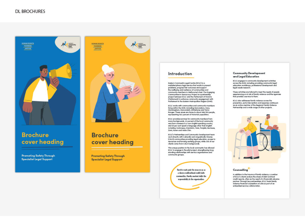
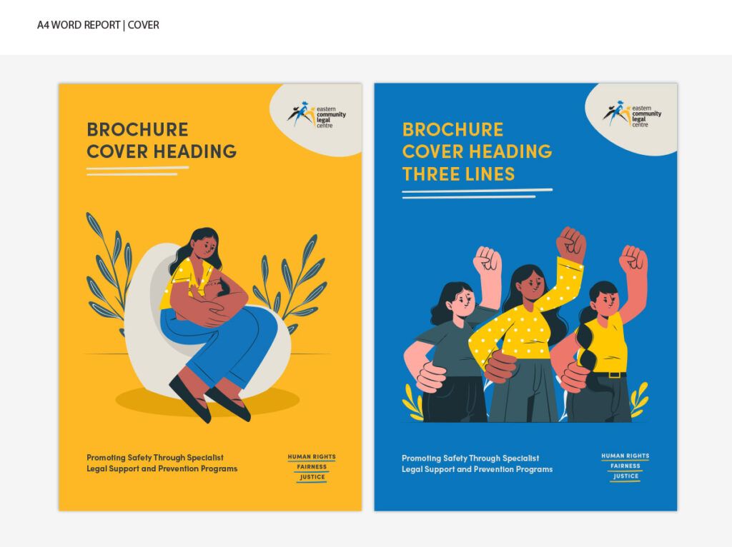
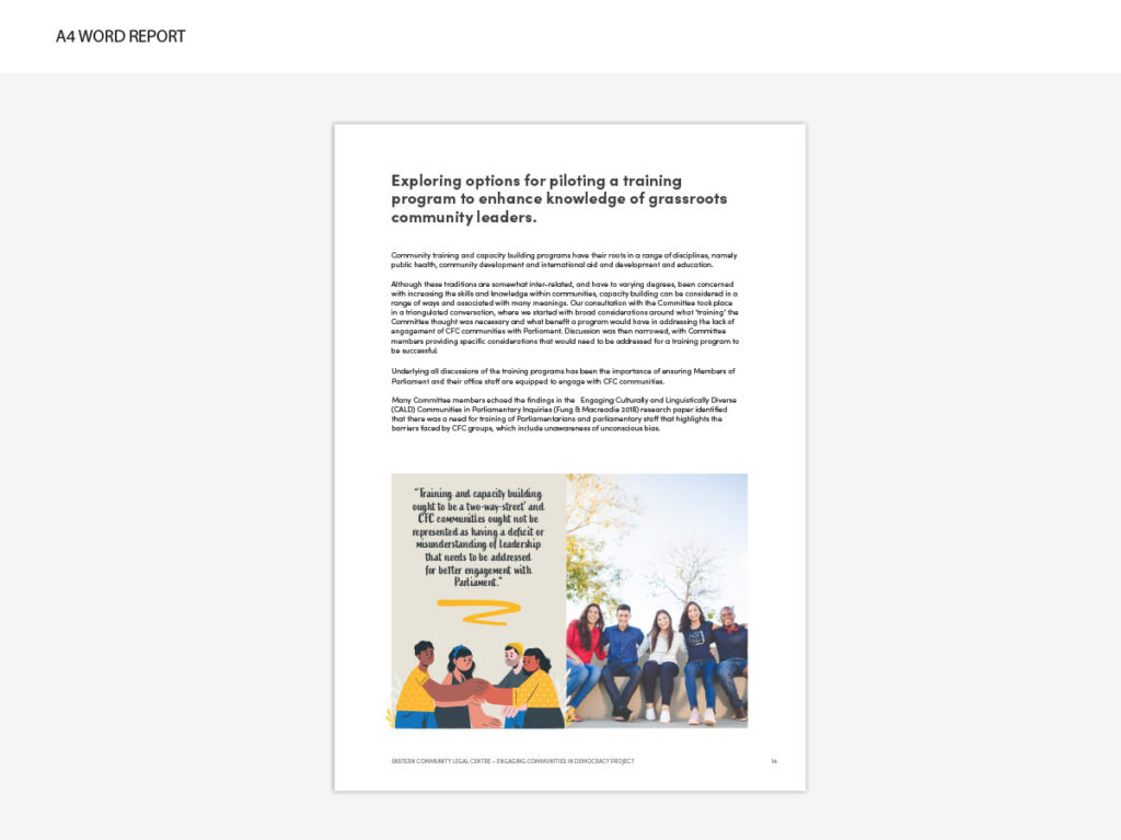
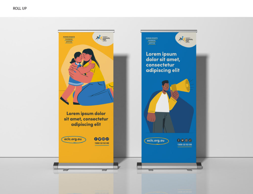
To demonstrate the versatility of the new brand system, we also designed a range of sample communication pieces including:
- pull-up banners,
- brochures and
- reports.
The result is a contemporary and cohesive identity system designed to carry ECLC confidently into the future as a leading community-focused organisation.