This post is a guide to assist marketing and communications professionals working in the not-for-profit sector who have been assigned the task of producing their organisations’ annual reports in conjunction with a graphic designer.
Below is a summary of the key elements we believe you should consider for producing a successful and talked-about annual report:
Timelines and pre-planning
Production
When it comes time to source internal and external resources for your annual report project it’s a good idea to set up a timeline for production. For example, know your distribution date, usually the Annual General Meeting (AGM) then work out the schedule back from then. You will also need to know how many copies you require as this can affect the print production time frame.
You will need to agree on the following dates:
- date the graphic designer will receive final content for the report from you
- date you would like to receive the first design draft
- how long it will take to complete the second and third rounds of changes
- how long it will take the organisation decision makers to edit and approve the final draft
- date the final report artwork will be supplied to the printer
Pre-planning the creative concept
Once you have chosen your graphic designer the first conversation between you should be about the creative approach. Discussions should include:
- what are our budget restrictions?
- what is the theme or message to be conveyed for this year? (refer to “the design concept”)
- what is the preference for image creation? (refer to “image sourcing and creation”)
- do we need to factor in a photography shoot prior to production?
The concept design (which usually includes several cover design options and inside template pages) can start before anything else. If you are concerned about tight deadlines this is a good part of the project to complete before the pressure hits! The final copy does not have to be ready for the designer to complete this phase.
The creative concept
We believe that an annual report must align with your brand’s vision, purpose and values. However an annual report can afford to take a side step away from its core brand guidelines. This allows the designer to create something fresh and unique for that particular year.
This doesn’t mean just throwing in a couple of fancy fonts and extending on the colour palette!
We suggest coming up with an underlying theme (concept). This one key idea will drive the creative direction and help us make choices about design elements. It will also guide the order of content.
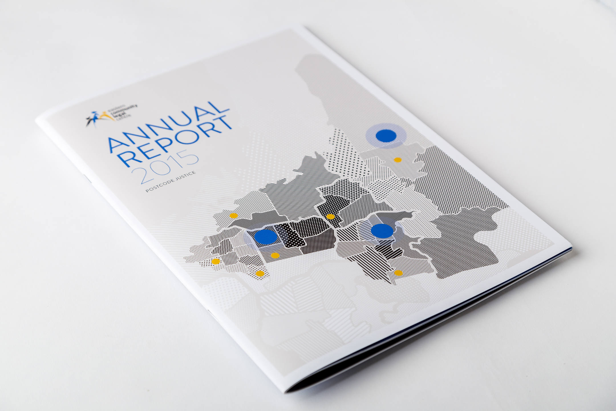
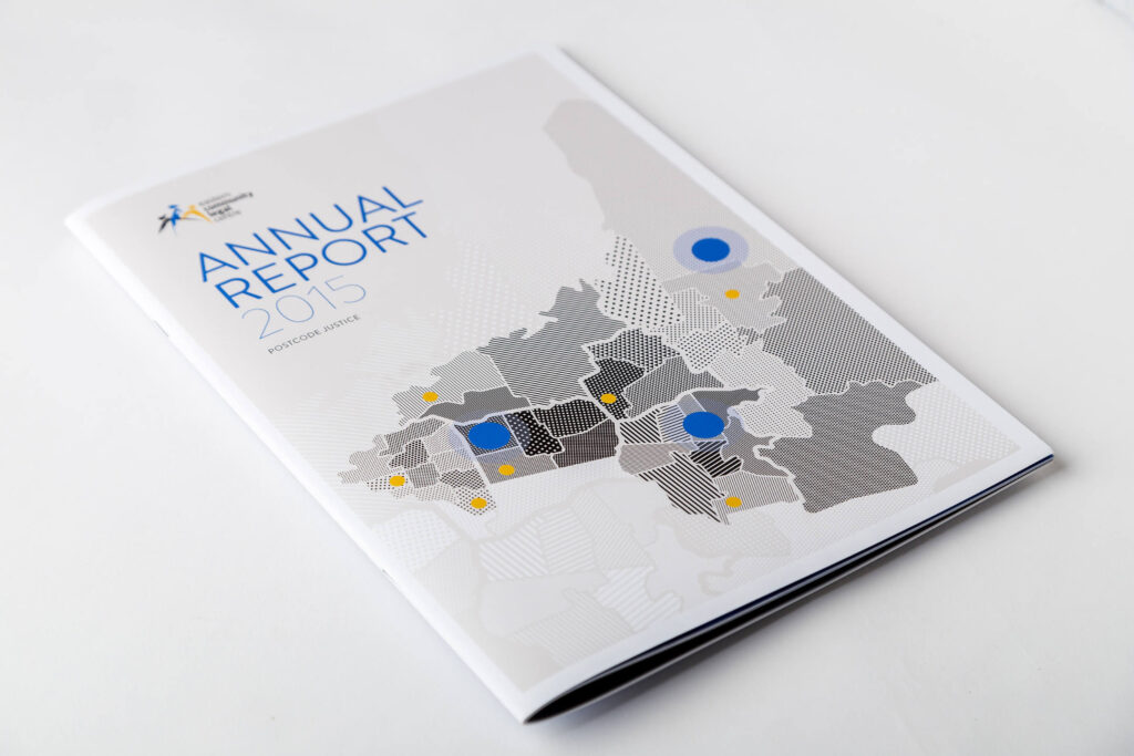
A good example of this was the annual report for Eastern Community Legal Centre (also shown below).
The theme was “Postcode Justice”. This concept gave us the opportunity to develop a striking graphic for the cover. The result was an original map of Victoria featuring all the branches of the organisation. We also used the concept to write the content by dividing it into Victorian regions!
Each region had a unique story to tell and this was a great way to showcase them!

Your theme could be less literal than the example just given. It could be visual elements used to simply convey an overall feeling or mood e.g. promoting an “active, outdoor lifestyle”. Photography, use of colour, and use of space play an important role. As well as highlighting key messages and statements in breakout quotes.
Infographics for annual reports
Every report has infographics nowadays! Hire a professional graphic designer to bring dull statistical data to life.
If the theme of the report is playful, there is scope to tie in the infographic design to this playful theme.
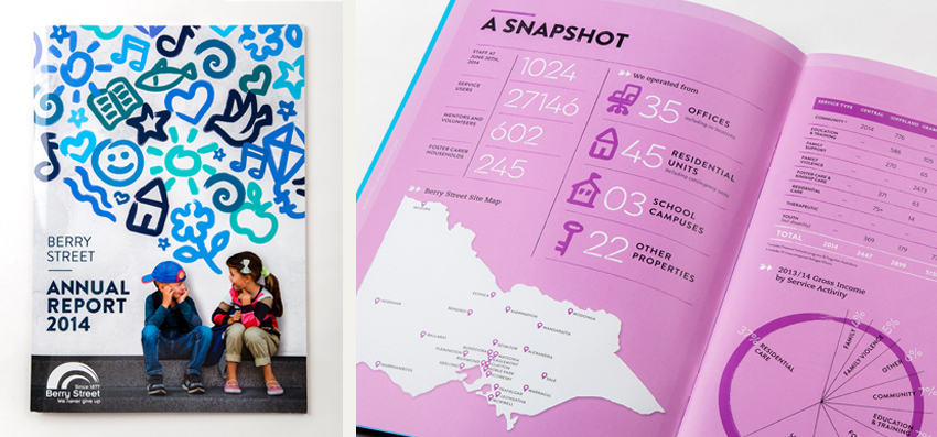
Below is a great example of an annual report with infographics. Hand-drawn icons match the hand-drawn elements of the overall theme.

Of course many reports require a more serious tone. Infographics should always fall in line with the annual report’s overall look and feel.
Expect that there will be more time spent on the creation of these statistical components in comparison with standard image and text pages. Time allowance for this should be listed in the quotation.
Handy hint: Infographics could also be re-used to create engaging stand-alone posters you can display around the office or in a waiting room.
Text, imagery and white space
The elusive battle between text, imagery and white space! A common problem when bringing all our elements together. Often we find there are page restrictions due to print budgets and its this factor as well as the number of words we try to squeeze in to an annual report that effects the end result!
Remember this! White space allows the reader to breathe. And as the saying goes, a picture is worth a thousand words.
It’s a wise idea to map out a framework for your annual report content. Alternating a heavy text spread of 500 words or more with a very minimal text spread of 50 – 200 words, can be a good way to think about it.
Even if the information is shuffled around during the design process, this at least gives the designer room to create breaks and variation in the layout.
Image sourcing and creation
How we create or source our imagery all comes down to budget.
Annual reports serve as an engaging showpiece of achievements for the year prior. Imagery, in all its forms plays an important role.
The following list shows the options available from most to least expensive.
- photoshoot (using outsourced photographer)
- original illustration created by the graphic designer (instead of photography)
- licensed stock photography (manipulated by the graphic designer to create original imagery)
- licensed stock photography (basic photo manipulation)
Handy hint: If you choose to appoint a photographer, think about how the new photography could be adapted in other communication pieces throughout the coming year! This can be a clever way to stretch your marketing dollar! A graphic designer can help you with these ideas.
Printing, stock and colour management
Printing
You have two options for organising the printing element of this project.
You can source several print quotes for the purpose of obtaining the cheapest price. The down side to this is the inability to predict the quality or the service you may receive by the winning bidder. Our suggestion would be to use an existing and trusted supplier, if you have one.
The alternative is to utilise your designer’s knowledge and expertise to obtain the quotations and manage the process for you. The major benefit is that if there are problems along the way, it is the graphic designers responsibility to fix them on your behalf. Graphic designers have long standing relationships with printers and benefit from this in terms of service, pricing and quality.
Paper stock
When it comes to choosing your paper stock and paper finish, we recommend that the graphic designer make this decision for you. At this stage, you could request a blank booklet sample which mimics the exact finish and thickness of the annual report at no extra cost. Just ask your designer to organise this before a final decision is made.
Colour management
Colour management is the final and most important part of the print process. Normally a prepress proof supplied by the printer will give you the opportunity to view a printed version of the report to check the final colours.
In cases where we need to match a Pantone colour (PMS) to the brand guidelines we always recommend a press check. At press check you can see exactly how the final job will print on your chosen paper stock. The print technician can then tweak the colour to match the PMS exactly. Your graphic designer can oversee this process.

